Earlier this year I attended a seminar given by Edward Tufte on Presenting Data and Information. Professor Tufte is the author of four books on the subject including The Visual Display of Quantitative Information and Beautiful Evidence. Edward Tufte is equal parts scholar and artist and a key topic of his books is telling a compelling narrative with the data you're presenting.
In my work as a software developer for a laboratory, I get to apply several of Tufte's principles on an almost daily basis. On the wall of my office I keep a chart that Tufte describes as "probably the best statistical graphic ever drawn". It's a map showing the fate of Napoleon's army during his disastrous Russian Campaign. Of the 422,000 men that went in, only 10,000 came out and on this chart you see it happen right before your eyes.
That’s not the only chart hanging on the walls of my office. There are others, and they tell a tale that is no less brutal but much, much more personal.
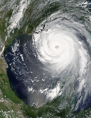 The first one is a picture, a satellite photo of Hurricane Katrina at about the height of its strength, taken the afternoon before it made landfall. I can’t help but think that it’s beautiful, a perfectly formed hurricane with swirling bands of clouds surrounding a clearly defined eye-wall. It’s only when you realize that it covers more than half of the Gulf of Mexico, extending all the way from the Gulf coast to the Yucatan Peninsula that you understand that you’re looking at a killer.
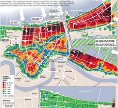 Next to that picture is graphic titled "How Much Water Did You Get?" which was published by the Times Picayune on 9/22/05. (Link to original PDF) It’s a map of New Orleans overlaid with a series of color bands that show the depths of flood waters across the city and the surrounding area. This is where the narrative begins to take shape. It’s easy to see the section around Napoleon Ave. that's called "The Saucer" because it contains some of the lowest elevations in the city. Looking at the dividing line of the 17th St. canal you can see how the story would have been drastically different if the levees had held. To the west of the canal was 2-4 feet of flooding caused by pumps not being able to keep up with rain fall (and also a poor decision to evacuate the pump operators before the storm). The 2-4 feet of water on the west side of the canal caused a great deal if property damage, but that was nothing compared to the catastrophe that's visible on the east side. On the Orleans Parish side, marked in deadly black, was up to 10 feet of water. I lived on the Jefferson Parish side, immediately adjacent to the 17th St. canal and if I had lived a mere 100 feet further east I would not have gotten off as lightly as I did. Between the 17th St. canal on the and the Industrial Canal, you find the London Ave. canal with its two breaches. It was one of these breaches that drowned the school where my girlfriend taught. (R.I.P. Jean Gordon Elementary)
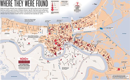 The final chart is another map published by the Times Picayune. It’s titled "Where They Were Found" and it shows the approximate location of where many of the bodies of the 1073 people who where known dead on 12/20/05 where found. (Link to original PDF) Because the bodies were so tightly clustered in some cases, the size of the circle on the map is used to indicate the number of bodes at a particular location. It’s when I begin to match up what I know about the city’s geography with the dots on the map that it really starts to get to me. The largest circles in the city itself are hospitals where patients couldn’t be evacuated before the storm and where people sought assistance after the storm. One of those large circles marks the location of one of the most controversial events of the storm, the alleged euthanization of patients at Memorial Medical Center after days without power or supplies. Just east of the 17th St. canal you can see the large circle overlaying the I-10/I-610 interchange where people gathered on the only high ground in an area that was inundated with 6-8 feet of water. Further to the west is a smaller circle which marks a tragedy that a competent disaster response might have prevented: the I-10/Causway intersection where hundreds of people suffered for days in the heat while they waited for buses to come and evacuate them. The circle there shows that for one of those people the buses didn’t come in time. Another needless tragedy is visible as a circle in an area without any flooding - a family that that asphyxiated because of the generator that they ran inside of their apartment. (FEMA: Misuse of Generators and Small Engines Proves Fatal - also, see update below)
In the lower right hand corner is a large circle that shows the location of St. Rita’s Nursing Home, where 34 residents drowned after the owners of the home failed to evacuate them and the staff fled the rising water. I still remember seeing the Jefferson Parish President Aaron Broussard breaking down and crying during an interview as he described how the mother of his emergency services manager died there.
Other circles are reminders of events almost too painful to think about. One of those dots in Arabi right next to the Ninth Ward is the story of paralyzed and bedridden Gloria Young whose husband stayed with her until the last possible minute, watching her drown in the rising floodwaters before climbing into the attic. (Deadly Storm Took Strong as Well as the Helpless) Another circle near the London Ave. canal represents Beenie, who luckydog told us about last year in Beenie Drowned In Her House. Imagine the diaries that have never been written, one for each dot on that page.
I find it amazing that something so simple as dots on a page can have such a powerful impact. This isn't just data - to me it's a coherent story, painful and tragic - one that I’ll never forget and the likes of which that I hope I’ll never hear of again.
*********************************************************************
Notes:
The Times Picayune has continually published an excellent series of graphics detailing the effects of Katrina. You can find the master index of the graphics at http://www.nola.com/... Special kudos to Dan Swenson of the Times Picayune for the images that he’s created.
I hesitated to mention Aaron Broussard's Meet The Press interview because the timeline of events he described has been proven to be inaccurate. However there's no denying the magnitude of the of what happened at St. Rita and his interview was a key moment in the Katrina timeline. Here are links to both a YouTube video of the interview as well as a Wikipedia article on Aaron Broussard and St. Rita timeline.
Update:
I knew that I had seen the information about the family that had died of carbon monoxide poisoning but couldn't locate it last night. Here's a link to an earlier version of the "Where They Were Found" chart that was published on 10/23/05 and that listed the Jefferson Parish victims in a side table.
