(Here are some really cool maps posted Saturday that are deserving of a wider viewing. Promoted from the diaries. SusanG.)
Since Wyoming doesn't have many counties, this wasn't exactly a big update. I did modify the coloration of California based on the certified results, which were mostly better for Obama so many of the counties are imperceptibly bluer, though I'm serious when I say imperceptibly.
One thing that I thought was interesting was how well Clinton did toward the southeastern side of Wyoming. Looking at the pattern, South Dakota may be a bit closer that originally expected. I will try to figure out the state Congressional districts in North Dakota so that the next update will better show the trends.
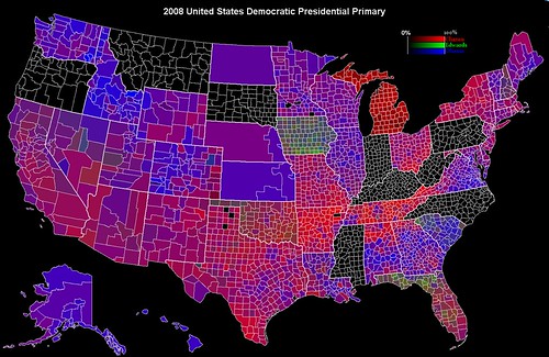
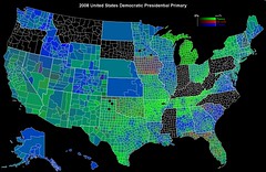
Now, I do know that the contests in Michigan and Florida are worth 0 delegates, and I very much agree with the DNC's decision because of the disruptive nature of having two huge states voting early (I'm an Iowan, what can I say?). However, I do think that the trends in both states are interesting, so I have included the results. I figure that those looking at the maps already know about the situation, but if people want a version where Florida and Michigan are blackened to signify that no legitimate vote has occured, then I will include a version with that modification in the Post-Mississipi version.
Update: I will note that the way to look at Michigan is to note how dark the counties are. The darker they are, the more people voted for Uncomitted (or Kucinich, Dodd, or Gravel). Many counties in Tennessee are "redder" than any of the counties in Michigan.
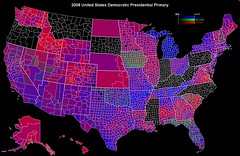
Also, if you want bigger versions, just click on the maps and go to the large size on Flickr.
On further note. I mentioned this in a previous diary with a previous version of this map. The size of these counties is proportional to their geographic size, not their population or voter turnout size, so there is some skew in how the red or blue some areas look. One thing to note is that Obama does much better in urban areas. Look at Nebraska. There are three congressional districts (that was the most detailed data I could find), which theoretically have the same population, but have vastly different sizes because of the population density difference between Omaha and different areas of the state. Furthermore, even there, a pro-Obama state which is overrepresented in geographic area, the rural areas were more pro-Clinton than the urban areas.
Tennessee is another example. Obviously Clinton won that state, but obviously not by as much as the map seems to indicate. You can actually tell where major cities are by how blue they are against the very strongly red rural regions of Tennessee.
