Back in November Fox News VP Michael Clemente was unhappy with his own network's quality. He sent a memoto the staff saying:
To share a key quote from today's meeting: "It is more important to get it right, than it is to get it on." We may then build up again slowly as deadlines and workloads allow so that we can be sure we can quality check everything before it makes air, and we never having to explain, retract, qualify or apologize again. Please know that jobs are on the line here. I can not stress that enough. I will review again during our Monday editorial meeting, and in the days and weeks ahead. This experience should make us stronger editorially, and I encourage everyone to invest themselves one hundred and ten percent in this effort.
Since then I've writtenMr. Clemente from time to time to let him know about on-air mistakes and to see if he is enforcing his own policy. Below is my 7th such letter:
July 1, 2010
Mr. Michael Clemente
Senior Vice President, Fox News Channel
1211 Avenue of the Americas
New York, NY 10036
Dear Mr. Clemente:
Again, I write to you concerning two recent errors on Fox News. On June 28, America’s Newsroom aired a chart purporting to show "job loss by quarter."
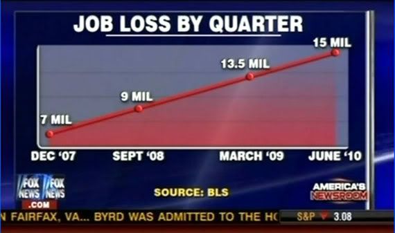
The chart clearly suggests that the job situation has continued to worsen. Of course, this chart doesn’t show job loss by quarter. What it actually displays is the number of unemployed during four random quarters over the past two-and-a-half years.
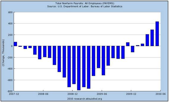
If your network had wanted to depict quarterly job losses, there is no getting around the fact that net job losses ceased at the end of 2009. A chart of the monthly change in jobs since December 2007, from the Bureau of Labor Statistics' Current Employment Statistics survey, looks like this:
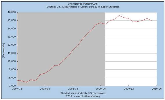
Even if the chart claimed to represent the number of unemployed, rather than the change in the number of employed, it would still give the false impression of a steady deterioration through June 2010. In reality, that chart would look like this (the level of unemployed from the Current Population Survey):
Fox’s chart has another glaring problem. It appears that the scale of the chart was deliberately manipulated in order to generate that straight red line.
The first interval on the horizontal axis, from December '07 to September '08, represents 9 months. The second interval, between September '08 and March '09, represents 6 months. And the third interval, from March '09 to June '10, represents 15 months, almost all of President Obama's term so far. So the third interval should be two-and-a-half times as long as the second. But in Fox's chart, it's shorter. This makes it appear as though the increases in unemployment during Obama's term were more dramatic than they actually were.
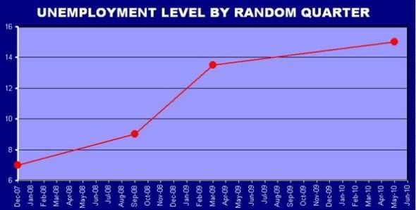
If the scale on the chart had been accurate, you'd actually get something like this.
But this chart doesn’t tell the whole story. Using only March '09 and June '10 as the final two data points obscures the fact that the number of unemployed essentially stopped rising in the fall of 2009.
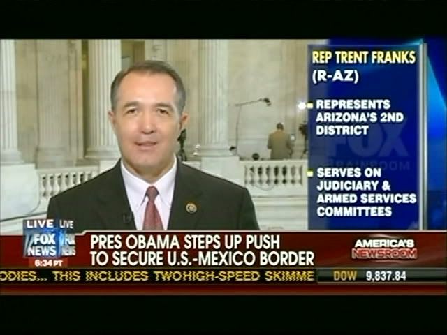
America’s Newsroom had another glaring error on June 30. As Media Matters noted this morning, Rep. Trent Franks (R-AZ) was misidentifed as an "Arizona Senator" several times throughout an interview. Here is the initial graphic that appeared during the interview:
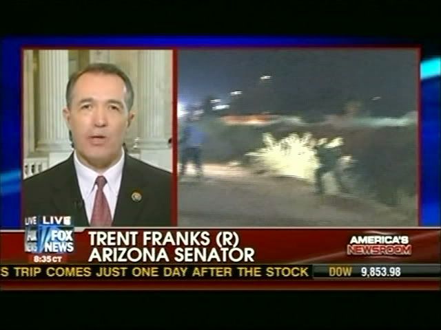
Moments later, Franks was promoted to "Arizona Senator."
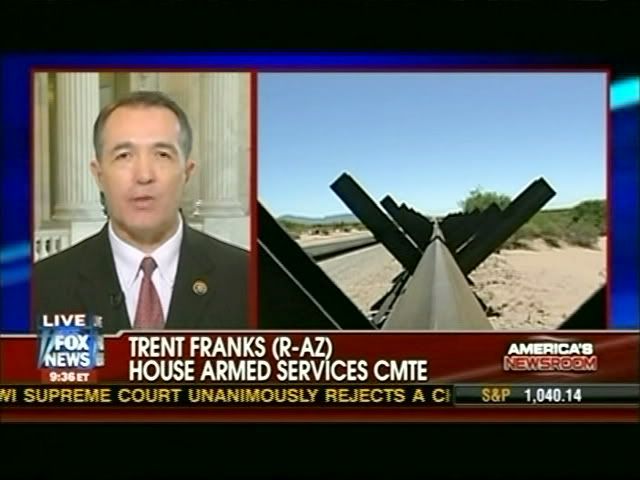
Franks was correctly identified a minute later...
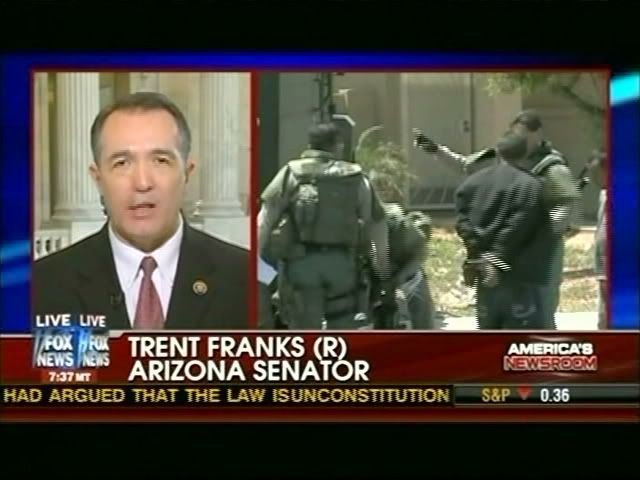
but was then bumped back up to being a Senator a minute after that.
I’ll remind you once again of the quality control memo your network issued in November. In that memo, it is assured that "mistakes by any member of the show team that end up on air may result in immediate disciplinary action against those who played significant roles in the ‘mistake chain.’" I have written you on six previous occasions about errors on your network and I have yet to see any "immediate disciplinary action" take place.
I look forward to hearing if that will be the case this time.
Sincerely,
Ari Rabin-Havt
Vice President for Communications and Research
Media Matters
