They say a picture is worth a thousand words. They say, "Show, don't tell." I will endeavor to take this advice to heart.
This is what I see when I log onto http://www.dailykosbeta.com:
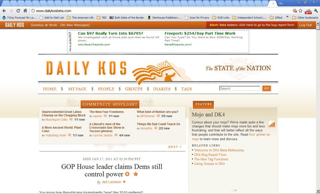
Where is the news? Where is the information? Where is the commentary?
It's all below the fold, crowded out by a gigantic, florid header that literally takes up half the window.
There is nothing to read on this screen.
Here's what I see when I scroll down one page:
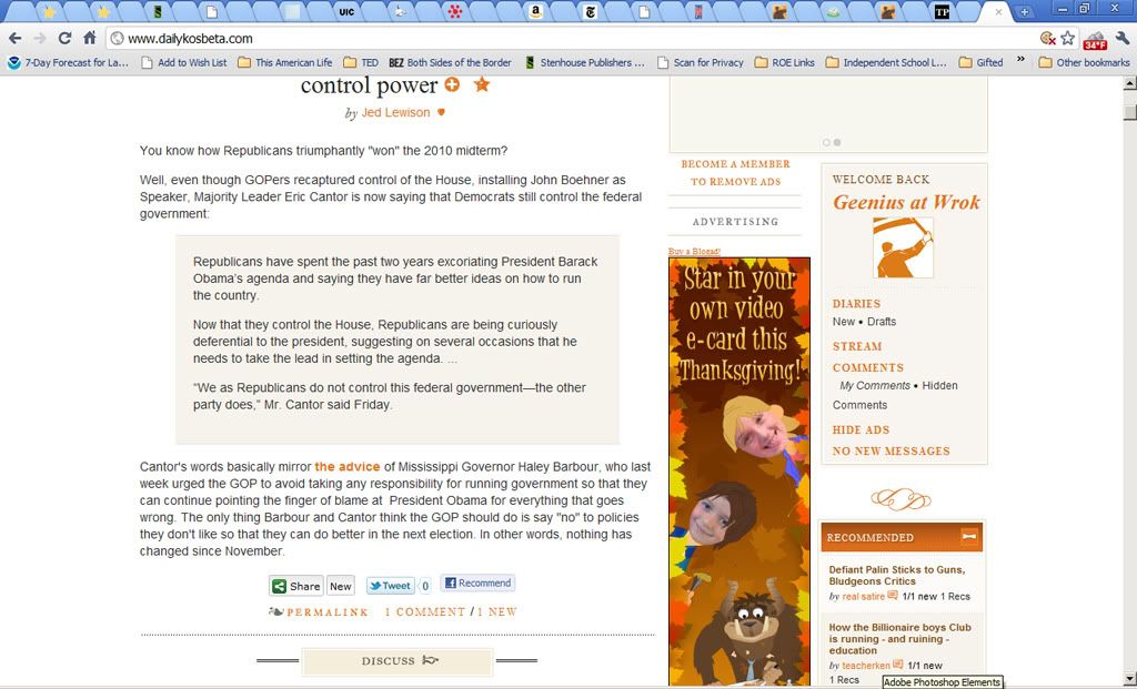
OK, here's something to read. (In Arial, which at a minimum is a typographical misdemeanor. Hey, cool kids, not all of us own Macs. And anyway, Helvetica is so 20th century. Get with the Frutiger already.) Over to the right, a big box o' greeting. I feel so welcome. (I assume I'm supposed to replace the little flag-waving guy with my A V A T A R, because there's nothing I want to do more when I go online than look at little pictures of myself.) Also, two recommended diaries.
Here's what I see when I scroll down again:
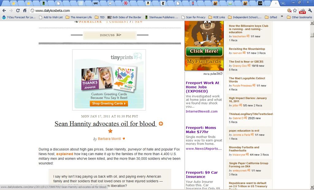
A big ad! Whoooo! And some lines. And one and a half paragraphs of another front-page story. And most of the rest of the Rec List.
In contrast, here's what I see when I log into Daily Kos 3.0, the purportedly obsolete version, today:
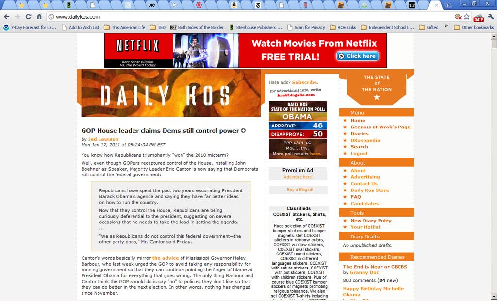
A whole story, as well as the beginning of the rec list. I can start reading right away. This makes me happy.
I have no idea what purposes all the new features of DK4 are supposed to serve. Some, I'm sure, will turn out to be useful. Others, not so much. (I tried Twitter because people -- including Markos -- were hyping it here, only to discover that it's entirely useless if you don't spend all your waking hours logged into it, checking up on it constantly. I'm not ready to go otaku yet.) I am by no means a featurephobe. Nor do I reflexively dislike change -- although it is my observation, over 17 years of using the WWW, as it was called back in those dim days, that change occurs on the Internet more often for the sake of change than for the sake of improvement.
But I am compelled to say . . .
. . . the design of this beta site is terrible. For one simple reason: When I arrive, when I visit it and look upon it for the first time, it offers me no reason to stay.
Journalism, whether professional or citizen, must do one thing before it does anything else: It must get the reader's attention and hold it. The home page of the new DK4 communicates a message: "I think highly of myself, but I don't have much to say." We've all met people like that, and undoubtedly, first impressions are sometimes misleading; one may find hidden depths after taking the trouble to get to know them. But how many of us, after that first impression, want to take the trouble?
Community is nice, community is excellent and admirable, but I come here for content. Give me content. Give me content on the front page. You can add as many gimcracks and gewgaws as you like, and I'll use them if I like them and I won't if I don't. But if you're going to get between me and my content, I'm going to go where no one is putting obstacles in my way, your precious community be damned.
