As this is my last diary on DK3 I wanted to do something a little different so out with the slightly bleak monochrome and in with really bright garish colors (and some pontificating of course).
Crossposted at my blog: Photography – Color | Minimalist Photography
Color Emphasize it or Lose It
Some see black and white photography as nothing more than elitist artistic snobbery while others see it as the only true medium. It is neither. I tend towards black and white for a slightly complex reason and a simple one.
The simple one is that I like working with tone and line. The thought process behind the more complex one starts out with recognition and/or resonance. I see something that interests me but it is rarely the whole scene that interests me nor is it one object within the scene. It is usually an abstraction i.e. geometry and the tonal contrast. This is not always the case though, sometimes it may be color, or more likely a particular combination of colors.
I am not a subtle photographer. I have a tendency to isolate the thing that draws me to a scene, whatever that may be and then really emphasize that, often at the deliberate expense of other factors. If for example a dramatic tonal variation draws me in I'll push the contrast as far as I can in post production (on the computer) where many photographers would pull it back to let other aspects such as color or composition show through. If it wasn't those other aspects that drew me towards the shot in the first place they are not important.
To my mind, the focus on a particular aspect of the composition gives strength to a photograph. As anyone who has spent time working within the visual arts would probably agree, nothing kills a piece faster than indecision on the part of the artist. Deliberate ambiguity can be a very good thing but only when it is intentional. My advice to photographers is always decide what you want from a project - 'a nice picture' just won't cut it. Deconstruct, think about all the photographs that you have seen that really struck a chord then look for commonalities.
Now how does this relate to color? Well, color is one aspect of a photograph. Personally I am more drawn to tone and line. To my eye color obscures these- very few of us can see a scene in front of us and accurately convert it to grayscale in our minds. This means that a color image is usually very confusing. Some photographers get around this by only photographing scenes with a few well defined colors while others will mute (desaturate) the colors in an attempt at harmony and allowing other compositional aspects to show through.
Some Tips for Working with Color
Most importantly keep it simple and remember that the camera see very differently to us. Whereas we have a brain which is great at processing out the irrelevant visual information the camera doesn't. A great view of a flowergarden in full bloom at noon will look like a complete random mess to the camera.
This latter approach strikes me as wrong - why not just lose the color rather than fight it all the time. The former approach is more my speed and I'll often go a step further and ramp up the saturation. If I am working in color it is the color that drew me to the image in the first place and that is what I am going to emphasize. As I said, I am not subtle.
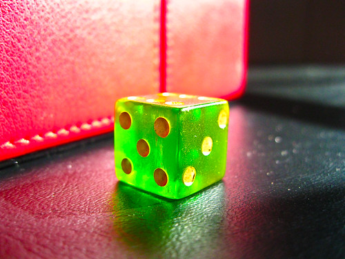
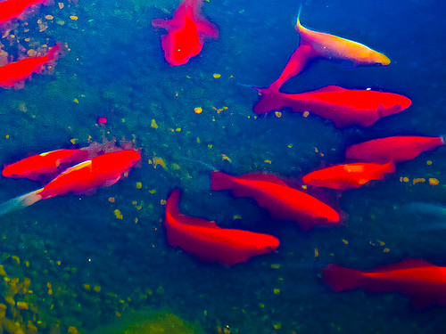
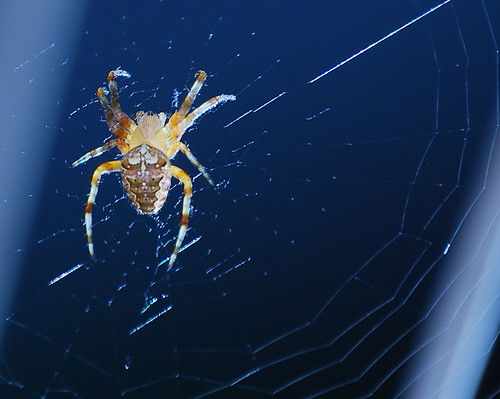
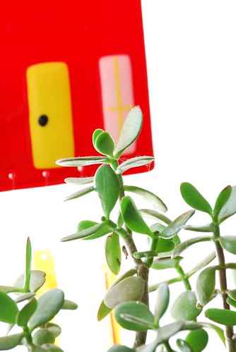
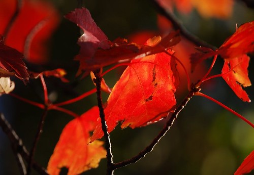
Look for complimentary colors for impact but again go for as simple forms as possible. The complimetaries are red/green (this is why red flowers always pop) orange/blue (probably my personal favorite) and purple/yellow. any one of these against its complimentary background will always look more intense.
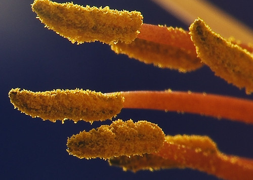
The following images here make use of the complimentary idea:
Green dice and red box
Goldfish in pond (in this one I happily sacrificed accuracy for impact!)
Spider
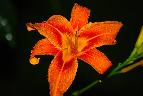
Stamens of a daylily macro
More on complementary colors
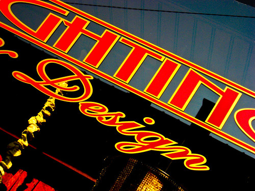
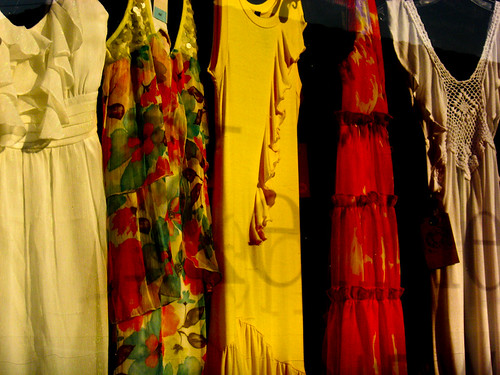
Simplifying is always good and one way to do this is to add black to the image. This is usually done using the contrast control in the editing software. A control that works with the midtone edges as opposed to the stretching the histogram method gets the best results. Lots more about this in my last diary Photography - Contrast
The following Images use this approach:
Lighting designs shop window
Dresses shop window
This is one of the dew times that flash can work in the photographers favor as it will only illuminate the foreground. So this is a way of adding black in camera:
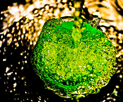
Flash was used with:
Green Beaker and running water in a sink (It's the one with the green disk)
Daylily after a storm.
Blowing highlights, makes all tones beyond a certain point white.
Glass House and plant (this pic also relies on complementary colors.)
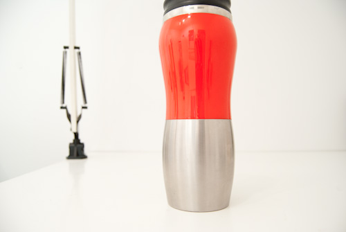
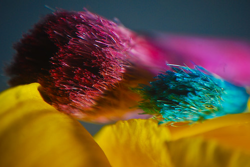
Sometimes less is more and a scene will just consist of whites and grays with a solitary bit of color. This effect can be crreated on the computer by desaturating all the colors that are not required. An image works better though if the artificial desaturation isn't needed.
The travel mug on the drafting table is an example of this.
Thanks for reading. I suspect that my next post will be bought to you in the usual monochrome.
