Polls, polls, and more polls. They can make your head spin. We've had about 200 independent samples of the national presidential race alone since the beginning of the year.
Which means we have enough data to play with and draw some lessons about the polls and pollsters in 2012. In brief: for a heavily polled contest like the national presidential numbers, you can, if you like, preserve your sanity by ignoring individual polls, and follow a polling average instead, like this. This is advice which is not new in the least but nice to have confirmed again by the data. Sequential polls by the same pollster can and often do have fairly large changes in the Obama-Romney margin that are consistent with random error alone. Polling averages smooth out the random error and retain the trends, although they take a little longer to respond to current events. Below, you will see just how jumpy the polls can be for no particular reason, and how different Rasmussen and Gallup are from the rest.
Onward to the data. First, we need a standard to judge against, and a way to judge that standard. I decided to use a local regression of all polls from pollsters who sampled registered voters, called cell phones, and released polls at (reasonably) regular intervals over the entire period. This resulted in a total of 48 polls from Pew, NBC/WSJ, Fox, ABC/WaPo, CBS/NYT, Reuters/Ipsos, and CNN. The local regression is the green line below. How close is the green line to reality? We can't tell, but I can tell you that the average of the final 2008 polls for the pollsters listed above was Obama +7.6; the actual result was Obama +7.3. I find that somewhat reassuring.
The blue line is the regression for
all 208 polls (I probably missed some). Notice how they both have similar trends, even though they diverge a bit after January, so we're not missing any
major dynamics with the green line. The Republican primary sent the polling margin soaring in Obama's favor as the country got to know Romney; then it gradually came back down as the primary resolved and Republicans came home, and it's been stable since the end of the primary. The grey line, however, is a more sensitive regression, and it shows a dip in early May that is quite likely real (it's not just driven by one pollster), following Obama's interview in support of marriage equality. The green line misses this entirely, so keep that in mind.
So here's how the most prolific individual pollsters stack up compared to the green line. What we want to see for a good pollster is for the data points to be evenly distributed above (erring in Obama's favor) and below (erring in Romney's favor) the green line, with no particular trend over time. Click on the graph to enlarge it.
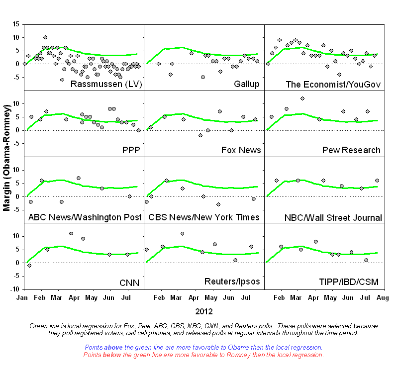
So who can you trust when it comes to polls? Nobody, especially not Rasmussen. Pick almost any pollster in the chart above, and you would get seasick watching it bounce up and down, even while the average is relatively stable. Conclusion: Don't worry about large changes in individual polls. Fluctuations in the margin of polls from any one pollster of more than 5 points are fairly common, and, in isolation, should be cause for neither concern nor jubilation. Also, there will sometimes be trends in a series of any one poll's data during periods of stability in the average of all polls; again, just watch the polling average.
More details below.
Another way of looking the polls is looking at the residual; that is, how far away the polling data is from the green line of the regression. For a real-world poll with random error, we would expect to see some points below (again, erring in Romney's favor) and some points above zero (erring in Obama's favor), with most polls just a few points away, but some that are maybe four points away, and an occasional outlier or borderline-outlier that is 6 or 8 points away. We also expect to see no trend. Click on the graph to enlarge it.

For some pollsters, most points are on one side of zero, showing the house effect, or lean, of the pollster. Some, especially Rasmussen, also show a trend over time.
The Ugly.
There's really no contest for Worst Pollster of 2012. It's Rasmussen, which probably comes as no surprise to anybody reading this. Their polls bounce all over the place, they have a fairly large lean towards Romney, and their residuals have a trend. They use a likely voter model, which probably explains most of the problems; nobody knows who is likely to vote in the winter and spring before a general election, not even the voters themselves (especially those who haven't registered yet!), among other problems (see Mark Blumenthal). We might be tempted to just add points to the Democrat for all Rasmussen polls to find some sort of registered voter equivalent, but the graph above shows that the difference between Rasmussen and registered voter polls is a moving target, something confirmed in California at least by PPIC data over the past few years. Although registered voter samples typically favor the Democrat, the magnitude varies, and sometimes there is little or no difference.
The Bad. (Or at least the Not-So-Great.)
Gallup, which has a trend in its residuals and a good-sized tilt towards Romney. Honorable mention goes to all the early likely voter polls - see Mark Blumenthal's post. (I don't know when an appropriate time to start using likely voter models may be exactly, but it surely is not March.)
The Good.
Everybody else. No pollster has excessive outliers or greater than expected variation. All the pollsters do show error, but no individual pollster can overcome random error. Myself, I plan to watch the polling average without Rasmussen and Gallup.
Follow the Bouncing Polls.
This section could easily be a separate post. One thing that is abundantly clear from these data is that even though the polling average has been remarkably stable since the Republican primary resolved, the margin bounces around quite a lot from one individual poll to the next. This is consistent with random error. If we look at sequential polls by the same pollster, excluding the months of January and May (to avoid periods of rapid change), approximately 20% of the time there has been a change in the margin of five or more points.
Some pollsters, like NBC/WSJ, appear to be less volatile than others. However, I would hesitate to draw conclusions comparing pollsters that are based on only 6 or 7 polls.
As far as unexplained or excessive variability, I see nothing of concern from any of the pollsters with more than a few of polls released. For comparison, I simulated 100 polls of 1000 respondents and weighted by age; the results showed that in 94 cases, the margin of a hypothetical nearly tied contest varied from +7 to -7, or a range of 14 points in the margin. Including the outliers extended the range to 17 points. No pollster has a range in the residuals greater than this. Additionally, for the four most prolific pollsters, the distribution of residuals does not look unusual. Deviations from the polling averages are entirely consistent with the combination of variable house effects (see next section) and random error.
House Effect.
If we accept the standard I defined above (local regression of registered voter, cell phone, regularly released polls) we could in theory calculate a House Effect of each pollster. For most pollsters, however, there is no observed House Effect, in most cases because N is simply too small so that the error bars include zero, for example, Obama +1.1±3.6. The only significant effects observed are CBS/NYT polls lean towards Romney (Romney +3.3±1.9), while Pew leans towards Obama (Obama +2.6±1.9).
The trends in residuals for Gallup, Rasmussen, and YouGov preclude any calculation of this sort. For example, while Rasmussen clearly leans towards Romney by about 5 points currently, if we had assumed this to be true in January we would have been way off the mark. (Alternatively, perhaps Rasmussen is the standard we should use and it's the residuals of all the other polls that have a trend. Mathematically it's possible!)
Outliers.
There are three clear outliers that stand out from their neighbors in the first graph, above. One is the May Bloomberg poll, which had Obama leading by 13 points, about 10 points more than the polling average. The second is a Rasmussen poll from March that had Obama behind by 6, and the third is a Gallup poll from February that had Obama behind by 4.


