I stumbled across a cute little page, courtesy of BarackObama.com that allows you to compare your tax savings at any income level for the Obama 2013 Tax Plan, under Obama's first term and for Romney's 2013 Tax Plan.
So being the data wonk that I am, I started punching in numbers to see how it rolls.
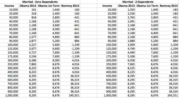
I ran a couple of different sets of numbers, one for Married Filers with No Dependents and one with Married Filers with Two Dependents. You can also select Single filing status and 0, 1, 2 or 3+ depenedents, so your mileage may vary. I ran the calculations from income of 10,000 to 1,000,000 where all the numbers seemed to plateau out (seems strange to me, but I don't know what is under the calculations). I am assuming there is some level of validity to these, and hope to not be proven wrong in that assumption, but saying that, this is what I discovered.
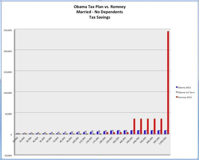
The Presidents 2013 plan allows savings to ramp up gently from $181 to a top end of $8,295, while the supposed savings during his first term of office were kind of comparable ranging from $1,640 to $8,676.
Romney's 2013 plan is radically different. Taxpayers with income up to $200,000 actually pay increased taxes ranging from negative savings of $-183 to $-1,339. However, over the $200K threshold, savings magically jump to $4,016 and at $500K jump to $36,319. At a million, Romney's tax savings jump to a cool $245,551.
I graphed the three scenarios, but on the first chart did not include the $1 Million dollar level, because it blows the chart completely out of perspective. Then I did a second chart with the $1 Million included to show how abusive this plan actually is. Looking at the chart, one can easily see how a reasonable progressive tax plan compares to a bizarro, shovel the money to the rich tax plan.

I also included the two numerical data sets for easy comparison.
See, all this tax stuff really can be fun!
That's all for now.
Medi Poli
