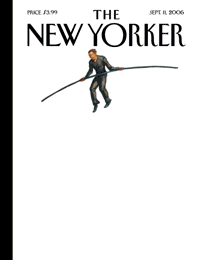
On the anniversary of the attacks on World Trade Center. I was thinking this might be a good time to talk about my cover idea that was used for The New Yorker on their 5th Anniversary edition. That cover won the American Society of Magazine Editors (ASME) "Cover Of The Year" in 2006... as well as being named Advertising Age's "Top Ten Covers of the Year."
Above is my final September 11 Anniversary cover submission...
The story (with images of the process) below the fold.
I've submitted ideas to The New Yorker for a while now... and I've sold four covers (one: unpublished, three: ideas only). I'm first and formost an artist, so it's been a disappointment to sell the ideas and not have my artwork used. But you take what you can get and move along.
The WTC attacks had been covered from pretty much every angle, so coming up with something fresh was my primary motivation.
Above you can see my final cover submission for The New Yorker I provided for the 5th Anniversary of the 9/11 attacks. I had played around with a lot of ideas before that one.
Here’s a few of ‘em…
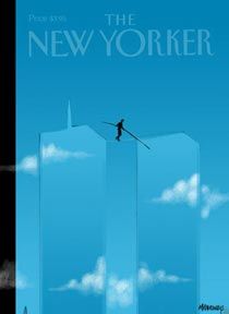
Early on, I started with the images of the missing towers only outlined by the breaks in the clouds. I liked that idea well enough to submit that. I knew people would always look where the towers once stood and would, with their mind's eye, fill in that space. I thought the blue sky and clouds could suggest what used to occupy that space.

…that one didn’t fly (although I still like it for the simplicity) so I worked on a few different angles…
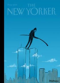
I had recently read about Philippe Petit, the man who walked between the WTC towers on a tightrope in August of 1974. I thought about how it would never be possible to duplicate that feat. But thinking about the strength and determination of New Yorkers on September 11th (and beyond) I thought,
“they could still do it…. and they wouldn’t need a tightrope”.
That lead me to this sketch:
The Art Director of The New Yorker, Françoise Mouly, called back and said they liked the idea. They wanted to see what I could come up with…
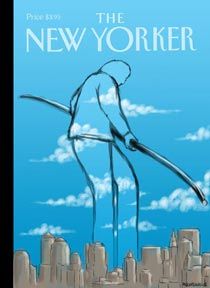
I tried a few more ideas around the theme…
cleaned-up version of the above idea (just clothes to reflect "everyone" idea
...Magritte influence, as well)... nope.
…then I combined the previous ideas…
Those didn’t quite work… so I tried a few more…
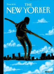
thought about using the legs as the towers… or the city as the tightrope… nah.
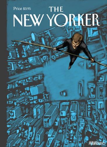
Finally, I went with the looking down version… over the WTC site. (the one you see at the top of the post.) …
…although I love this image, The New Yorker still thought it wasn’t quite right and it was passed over to the excellent Owen Smith. Owen promptly knocked it out of the park.
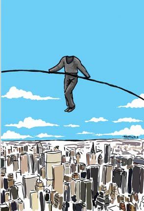
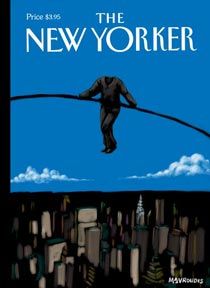
It was made into a double cover… the outer layer: the figure of Petit floats against nothing…. the inner one: reveals the city and the Tower footprints below.
I've heard back from a lot of people with kind things to say about that cover and I'm still very proud of it.
.....................
From the ASME website:
From The New Yorker: For the five-year 9/11 anniversary cover,
John Mavroudis’ concept was to stay away from the surfeit of images that recall the horror and remember the wonder of Philippe Petit’s 1974 tight-rope walk between the towers. The result in Owen Smith’s painting is magical: the walker, in the absence of towers and rope, remains suspended in the white space of a blank page.
The two-part cover (a first for The New Yorker) is a memorial to the spirit
of humanity and those who died there, and especially to the man who did
a perfect dive as he plunged to his death.
Here’s what Advertising Age had to say:
“Even those who don’t remember Philippe Petit’s 1974 high-wire walk
between the towers of the World Trade Center feel this void. A second
cover, behind the first, filled in the white space with the
footprints of the towers. “Soaring Spirit,” by John Mavroudis and
Owen Smith, tugged us upward without forgetting the fall.”
Cross-posted on my
ZenPop Tumblr blog.
