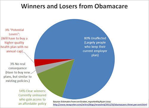
It sure would be nice to see the Traditional Media get riled up about that 14% slice of pie, eh -- it eclipses the one they care about by almost 5-fold.
So much for taking the "wholistic, systematic view" on our nation's problems, eh? That's just not something our Media does anymore.
Obamacare's Winners and Losers, in One Chart
by Jonathan Cohn, NewRepublic.com -- Oct 31, 2013
[...]
larger graphic
Here is the fine-print from that Chart, writ-large:
Winners and Losers from Obamacare
80% -- Unaffected: Largely People who keep their current employer plan.
14% -- Clear Winners: Currently uninsured who gain access to an affordable policy.
3% -- No real consequence: Have to buy new plans, but similar to existing policies.
3% -- "Potential Losers": Will have to buy a higher-quality health plan with no annual cap.
There ARE "winners" under the ACA law (the previously
Un-insured), in case the Traditional Media cares to remember their Journalistic duty. PS. It's called reporting the facts.
Here's another Chart, that I hope with the ACA's new focus on Wellness and Preventive Care, will someday bring the American Health Care system back in-line with the "effectiveness" curve of the rest of the world.
That is, that we Americans start getting more "bang" for our Health Insurance "buck":
The U.S. Health Care System Is Terrible, In 1 Enraging Chart
by Mark Gongloff, The Huffington Post -- 11/22/2013
Hello, did you know the American health-care system is terrible? It is. Don't let John Boehner tell you otherwise.
If you're unconvinced, here is a chart that demonstrates its terribleness. It shows, using OECD data, how much money different countries spend on health care per person, charted against life expectancy in each of those countries. As you can see, there is a pretty close relationship between health-care spending and life expectancy. Except for one very, very terrible country. Can you spot it?
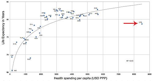
larger graphic
[...]
"What bothers me most is not that we’re all the way on the right, or even that we are lower than we should be," Aaron Carroll, professor at the Indiana University School of Medicine wrote on his blog of the chart. "It’s that we are all alone. We are spending so, so, so much more than everyone else."
Having lost my Mom to cancer this year, and the non-urgent, non-insightful, non-involved "standard care" she received -- I can attest to the "terribleness" of our current 'profit-based' health care system.
She was only 76. She was a Medicare patient. She spent her last 6 months unable to eat "real food." Her last month unable to speak.
Her last week wondering what went wrong -- and "Is that all there is?" ... (It's not suppose to end this way ... Is it?)
Over this last "terrible" year, she took scads of duplicate invasive tests; she saw a cadre of different over-worked "specialists" -- but not a single professional who "advocated" for her week-to-week wellness.
Not even when she got "promoted" (progressed) to Hospice Care status, did "wellness" enter the system's cost-equations; the part-time professionals in that camp are tasked "managing pain" -- not with "extending life."
Very strange, that last qualifier, I thought. When the system, signs off on you, they really write you off. It's cheaper that way, I guess ... for everyone -- tangentially involved.
To our "best Health Care system in world" (as Speaker Boehner keeps saying) -- she was just another "inevitable statistic."
To those who loved and cared for her -- my Mom died far, far too young. Far too abruptly.
She died receiving that "standard" routine care, that failed to deliver. Which failed to kill the tumor, which eventually killed her.
That's "one" terrible outcome, indeed. Chalk it up to a long line of other such outcomes ... for the "greatest health care system in the world."
-- If you believe the rhetoric, and not the cold facts.
May she rest in peace; and be long remembered. May we all someday find the care we actually need. Dare I say, that we all deserve.
We should expect no less, in a compassionate, modern civilization ... imho.

