Sometimes the numbers on the rich and poor boggle the mind. Let's take two sets of numbers:
1. The % of GDP that the top 1% have received in every year since 1980
2. Compare to the amount they would have received if their share of total GDP has remained the same as in 1980. The data on the top 1% share of GDP is from EPI here. GDP data is from the St Louis Federal Reserve Board here.
This diary has three charts.
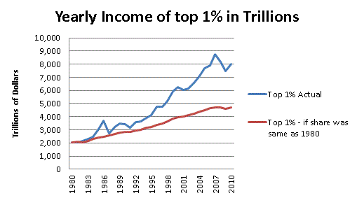
First, Let's compare what the Top 1% actually received to what they would have had their share of GDP remained stable.
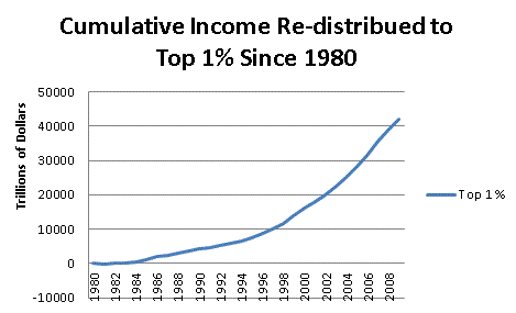
Second, Let's look at how much this is in total.
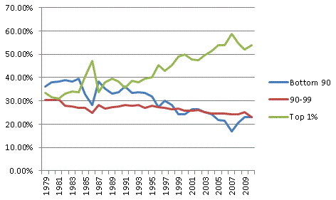
Third, Here is the trend in income share.
Again, not much of a diary, but in this case a picture is a million words.
