Last week, in Number Sense 030, we took a look at a situation where two quantities were related to each other. We used Cartesian coordinates, commonly called a graph. This week I'm going to expand on the graph a bit, and take a look at what else we can do with it.
Last week, we invented a plausible relationship between the size of a goat herd and how many acres of land it would take to feed the herd. Had we labeled the graph we produced, it would have looked like this:
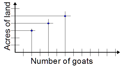
We also noted last week that, even though we could draw a line through the dots, this would only show us where other dots might be located, since we couldn't have a solution with partial goats or negative goats.
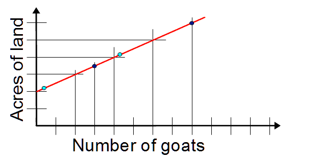
The dark blue dots are solutions for three goats or eight goats. The light blue dots correspond to half a goat or four and a half goats, so the acreage shown by the graph is not correct, since half goats don't eat.
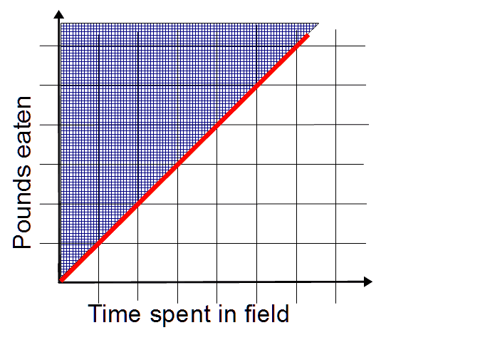
Let's invent a situation where the line is an accurate solution for all points on the line. Let's say we have a herd of ten goats. When we take the goats out to the field, they begin eating, running around, playing and so on, as goats do. Let's suppose we have some way to measure how much they eat, and we discover that, on average, these goats eat one pound of biomass per hour. (Hey, they're goats – if it's green, they'll eat it.) So if we leave the goats out for an hour, they'll eat one pound. Half an hour, half a pound, and so on.
Here we have a relationship, not of goats to weight of food, but of time to weight of food. The goat herd stays the same, but the amount of time they have access to food can vary. So, our graph would look like this:
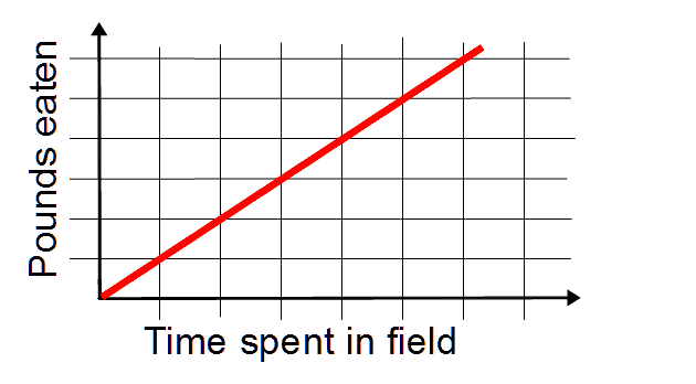
In this graph, we can take any amount of time and find out how many pounds of food is eaten.
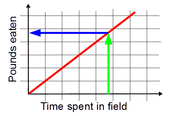
Starting with time spent, we raise a green arrow up to the red line, then follow the blue arrow back to pounds eaten. We don't have to be on one of the grid lines, we just draw those in for convenience.
Now we will add another real world wrinkle to the goats in the field situation. Sometimes the goats will be hungrier than at other times. When we take the goats out, some will start eating immediately, some will play. When some goats stop eating to play, other goats that were playing will start to eat. Our graph assumes that at any particular time, some goats will eat, and others will play, but for the whole time, all the goats will both eat and play. If the goats are especially hungry, they will spend more time eating and less time playing.
We said earlier that we discovered the herd of goats ate one pound of biomass per hour. That is an equality: consumption = 1 pound per hour. We will make this more realistic by saying that we discovered the herd of goats eats at least one pound per hour. They might eat more than that if they are hungry that day. Now we have an inequality: consumption ≥ 1 pound per hour (consumption is equal or greater than 1 pound per hour.)
The red line on our graph now shows the minimum amount we expect the herd to eat. They might eat more. We show this on the graph by shading in the area of the graph that shows higher amounts of food eaten.
Now, when we know the time spent, and we raise the green arrow...
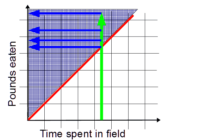
Any where the green arrow crosses the shaded area is a possible solution.
Have fun in the comments
