Those of you who've read some of my past diaries know that at times I like to play with maps. It's really true that a picture is worth a thousand words.
My interest in Cartograms began when I was looking for a way to debunk the Red State America maps being spread about by Republicans and the equally faulty NeoCon dogma that went with it. 
I knew next to nothing about maps and cartograms then - I just knew I wanted a way to show the real story of so-called "Republican Dominance" truthfully and pictorially.
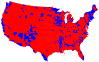
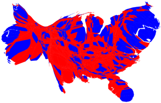
That resulted in my first diary at DailyKos just a little over a year ago. So if you want to see what the cartogram on the upper left represents (try to guess before you look) and have some fun seeing a few more, please, "join me after the fold."
Quick Review! (Skip down if you know it):
If you want the nitty gritty on what cartograms are and what the represent, read this diary. The short version is this. A cartogram can take a misleading map like this electoral map by county on the left and turn it into something which more accurately portrayed the red/blue divide of 2004 (or 2006)
(Many thanks to U of M's Michael Gastner, Cosma Shalizi, and Mark Newman.)
The World
Another way to use cartograms is to demonstrate population or economic data such as I did in this diary on the global trade deficit.
You start with a land area map:

The cartogram for population redraws the countries so that their relative size represents number of people instead of land mass:

Look how big India and China are!
(World maps © Copyright 2006 SASI Group (Univ. of Sheffield) & Mark Newman (Univ. of Michigan and courtesy www.worldmapper.org)
See my diary for more world examples.
Doing My Own Thing
Previously, I've always used other people's cartograms to demonstrate the points I was interested in. But I always found myself wanting a specific type of cartogram that no one had made yet. So recently, I've been working on learning how to create my own.
And I've finally had some positive results! One reason I'm doing this diary, is this is all kind of new to me, and I'm learning and experimenting and teaching myself about this stuff as I go.
I have now successfully generated my own cartograms!
Using US population and census data, I decided to produce a cartogram depicting African American (Black) populations in the US.
Besides the technical issues of figuring out how to do it, there's also an almost even more complex job of interpreting what you've rendered correctly.
My first success looked like this:

Yay, I did one! But actually there are problems with it.
Because this maps based on the number of Blacks in the state, it is skewed towards states with large populations. In other words, California, Texas, New York and Florida don't necessarily have more Blacks per capita than other states, it only looks that way because they have more people overall. So the representation is not quite right.
So instead, I did one based on percentage of Blacks by state. This one was a little better:

But there's still a problem. My color choices suggest that some states are heavily Black while others are less so, but still heavily Black. But this is misleading.
It turns out to get a decent cartogram, you have to go another step and use some good mapping software to help you with the colors and other issues. It's part science part art and I'm still learning.
Here's my final effort which you saw at the beginning(click on it for a larger image):

It's more readable, the color choices better reflect the data, the states are labeled and easier to identify. (IMO!)
Moving Forward
My plan is to do one soon on numbers of Americans killed in Iraq, but before I do that one, I wanted to do a warm-up diary (this one) in case I make any mistakes, I want to get them out of the way on this diary. (
So feedback and constructive criticism are requested and appreciated. Also I'd like to know what kind of information and issues you'd like to see represented in this way. I'll try to take some of the best suggestions and and see what I can come up with.
I'm still learning, but I've come a long way. I owe it all to the folks at Daily Kos who have read and commented on the past diaries.
Thank you all very much!
:: ::
Update [2007-6-21 22:53:30 by BentLiberal]: Last but not least, special credit also to Frank Hardisty's Cartogram Site, and his program which uses the Gastner/Newman algorithm.