WELCOME AND INTRODUCTIONS!
We think you may need a respite from the various political and microbiological plagues we are now facing. This is a boutique Expo exhibiting the works of some of the Poets and Artists at daily kos. We will endeavor to provide a new one each Sunday until we all get back to normal. Instead of our usual museum, we will publish these smaller “Salons” with more commentary from the Artists and Poets.
We want you to feel comfy. Please enjoy!
Poetry and Commentary by Angmar
The Hauntology: Looking at 1975
.
Childhood
It seemed like eternity, awaiting us
Unchanged through seasons, Christmas and Halloween
Deep snows, rainy Autumn leaves, sitting on the heating duct
eating cinnamon toast, grandma drank tea.
They called us, back in in 1969, to see a man land on the moon.
We waved at the black and white tv, thinking we saw Forever
Orbiting, turning- in Time: "All stories are, more or less, ghost stories"
haunted by a nostalgia, for all our lost futures.
(Angmar 2020)
(I will just say that I personally always try to work from life.
It's always filled with much meaning-
especially lately..…)
-Angmar
 Angmar
Poetry and Commentary by hay seed
Removing the these’es
A racing heart
Unto the breach
In my idle moments
I burned all the words
For the instant of warmth
Hope they found paradise
From the void I peek
Lots of space
Around some corner in time
That next big theme waits
Then cry ‘’Havoc!’’
But don’t let that baby slip away
Again
*
Tonight we burn
The hosts charm and beguile
Whatever leaves
Goes in orange flames
And nine inch smut tags
Can we burn away the one
Consume the lost, the hollow
Change in time
All the same
The rendered ashes will cleanse
Leaving behind an imperfect duality
A new founding
Tonight we burn was written by an outdoor fire, on the winter solstice. It’s themes of spirituality, and renewal, are pretty common for me. My motivation for writing a poem varies but this time it was to ‘’capture a luminous moment.’’ Wallace Stevens said ’’All poetry is experimental poetry.’’ For me it’s a search for ways to depict emotions with a few words. I started writing last winter, stuck in bed, recovering from a minor surgery. I had been scribbling some things down, and one night I was scrolling through this web site I like to look at, and ran across a diary called Classic Poetry Group. That’s how I connected with this group of talented artists. Writing was a lot of fun at the time, but I thought “in a few days when I am up and about, I will lay this aside,” but that has not happened so far.
(hay seed 2019)
 Chuas2
Bats and Butterflies
.
Friends think of me
(They tell me)
when seeing bats, and butterflies
Strange days seem to be always with us, now-
elegiac times.
At least we still have memories
always- fragile as wings
of the ones who gently touched our lives
and then drifted, softly away
(Angmar 2020)
 Chuas2
 Christopher Lopa
 PFF
PFF
 Chuas2
 Christopher Lopa
 Forester Bob
 Angmar
 PFF
PFF
Is the moon tired? she looks so pale
Within her misty veil
-Christina Rossetti
Sculptures and Commentary by dot farmer
 “Gone” by Frank Lyne (Dot farmer) — based on extinct Ivory-billed Woodpecker
 “Gone too” by Frank Lyne (Dot farmer) — based on extinct Woolly Mammoth
My two most recent carvings are related in several ways. Both are made of walnut with added elements of deer bone. Both depict animals now extinct. Thus my titles, Gone and Gone too. Too is spelled in the sense of also, but could have been spelled two. I’ve previously written about each of these sculptures, but putting them together in one place shows how the concepts and titles are related.
This quarantine has put a damper on my creative impulse because until it’s over, there are no public venues for exhibits. My wife Alison and I both currently have work at the Kentucky Museum in Bowling Green for what was to be a month long exhibit. The museum closed soon after the exhibit opened and will remain closed with the artwork in place for the foreseeable future.
Other upcoming juried exhibits that we usually enter each year will likely not take place.
I do have an as yet un-started carving “contracted”. My 10 year old great, great niece wants me to make her a sea horse, her second favorite animal after shark. She says she wants to pay for it herself rather than let her grandfather buy it for her. With that in mind, she says I should try to complete it by either her birthday or Christmas because she always has some money gifted to her then. She recognizes that she isn’t thrifty enough to save money, but will be flush with cash for those two short periods. I’m seeing grist for a future diary in this project.
Drawings and Commentary by duccio46
 duccio46, “The weight of financial responsibility”
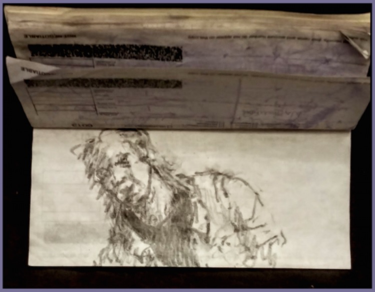
These checkbook drawings grew out of a need for small pads to write notes and lists for myself. I started keeping them in my car and on my desk for those purposes, and before long I started using them for small sketches when I had an idle moment when out and about. I liked the texture of the carbon copy paper for drawing. I started to do a series of drawings of Roman marble busts I saw in books, and then thinking about them as leaders from long ago, I started drawing Congress people, Cabinet members, and Administration henchmen like Gen. Flynn, Papadopoulos, Roger Stone, Carter Page, Devin Nunes, and IMPOTUS Ozymandias himself. Something about the ambiance of a checkbook and these people seemed to resonate. Occasionally I have used the checkbook format for comment drawings on the various horrid US policies I read about in Daily KOS.
 duccio46, “Colosseum interior / exterior”
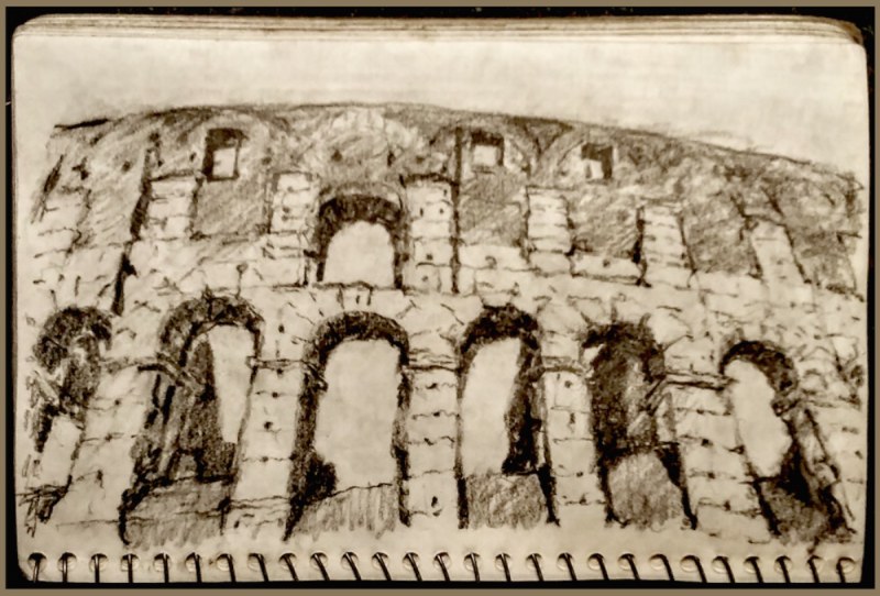 duccio46, “Colosseum interior / exterior”
These other two drawings of the Colosseum I did while thinking about how this building is the singular, most famous representative of the Roman Empire. (I've been there.) How it was used for blood sport and to distract the minds of the populace from the crimes and intrigues of the rulers and keep the Plebes from focusing on their real problems and demanding solutions. This was a colossal part of the infrastructure of control in the Roman Empire. Now, it is a tourist attraction, needing constant maintenance. It’s the wreck that remains of a past civilization. It makes me think of us, now.
The interior picture, I started by drawing the partial ellipses dividing the various levels of the amphitheater, these all have a different perspective as they are at differing levels in relation to the vanishing point of the invisible horizon. Then, I started along the top and generally worked down from the upper left corner to the lower right corner. I didn’t want to smear already completed parts of the drawing with my drawing hand, so this procedure prevented that. When finished, I had to go back and strengthen certain areas and work back in with an eraser to smudge some areas to make them recede. I was pleasantly surprised how the perspective of the whole worked well and that I was able to hold it in my mind accurately while systematically drawing in the various parts.
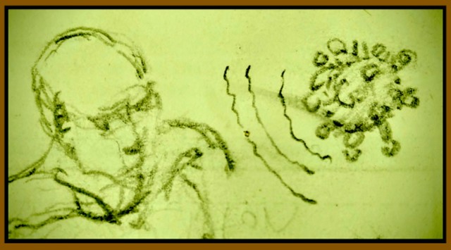 duccio46, “Coronavirus pandemic”
I have been drawing for a long time. I use drawing as an aid to thinking, and also as a way to leave the world of anxiety and simply try to work towards self awareness. I know how my drawings should look and work towards that as I draw. I start with a subject, but gradually, I become concerned with making the drawing work on it’s own terms and not simply as a reflection of some other reality beyond the limits of the paper I am using. I would say I have a painterly drawing style that is not so interested in rendering a copy of reality, but instead is concerned with making the drawing as interesting as possible according to my own aesthetic judgments.
I like to use these big fat children pencils called My First Ticonderoga pencils. I buy them several boxes at a time off Amazon. They have big thick #2 leads that can stand heavy pressure without breaking, so one can vary the weight and darkness of line, it's visual speed. Drawing on a pad gives thick soft lines, while drawing on a harder surface gives a sharper thinner accent kind of line. The heavy line can be allowed to fade out and then come back. I like to work the drawings by using different weight of line, different kinds of light and dark using tone or hatching techniques, controlled and semi controlled marks for emotion or stress, and using erasers to smear some areas to make them recede in pictorial space, or erase a tonal area heavily to create different types of white from the pure white of the paper.
I was asked to be like a professor a little bit, and talk some about my drawing technique and philosophy, so the above was a little bit of some of the technical things I do in my drawings to make them look like I think they should. They always have to be complete in themselves and not simply renderings of something “over there”; that’s the main thing: their raison d'etra.
Painting and Commentary by mflinn
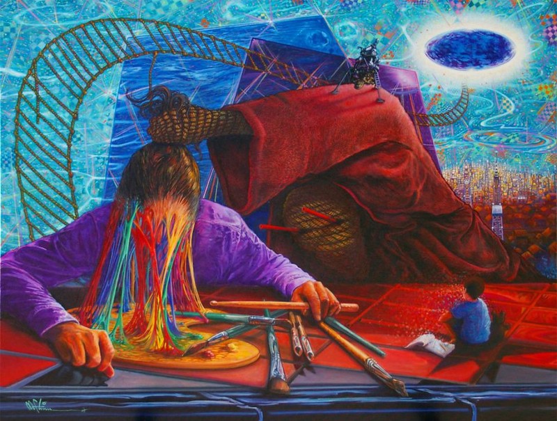
“Le Morte d’Art Tour” • By Michael Flinn • 40” X 30” • Oil on Canvas • For sale by artist
First, I’m pleased to be here, included with my fellow Exponauts and I want to send best wishes for everyone’s health and happiness in these weird and difficult times. Sincere condolences to those who have lost loved ones. Peace be with you.
I am hesitant to discuss the content of the paintings I make, and I’ll cite an incident that might, in a general way, explain why. At a gallery show a patron once asked me why I’d painted skeletons crawling down a ladder from a stylized cloud in which a much larger skeleton wearing a Santa hat flashed a “peace” or “victory” sign amidst a glowing halo - and who did that fabulous face in the foreground belong to?! I skirted the first part of the question because I really didn’t have a reasonable answer but I proudly exclaimed, “That, sir, is the author, William Peter Blatty!”. The potential buyer’s face nearly collapsed in what was obvious disappointment. I don’t know if he had some personal dislike for Blatty but his interest in the piece seemed to have vanished into thin air. I’ve given it a lot of thought and I’m convinced that by giving a name to the foreground guy in the gold byzantine helmet, Blatty that is, I robbed my own painting of a sense of mystery. What had appeared to be a meaningful placement of a sinister man with a stern expression turned out to be nothing more than the depiction of the writer of, “The Exorcist” ? Seriously? Bummer.
I did not make a sale on that occasion but I learned a valuable lesson. Unless you’re extraordinarily gifted at expressing artistic gobbledegook it’s best not to reveal too much about a work’s content or the thought processes that ultimately lead to its creation. It’s like they say about meeting one’s heroes in life - it’s bound to be disillusioning.
So, after all that what can I say about “Le Morte d’Art Tour”. I think I can reveal that I love the incongruous. I enjoy placing together elements that have no apparent connection or ones that even sound blaringly unharmonious notes. Likewise I can tell you that unintended elements find their way onto my canvasses while they are in progress. If an idea occurs to me that requires a complete overhaul of the composition, I’ll do the overhaul - even if the new detail I want to incorporate seems unimportant. It’s a slow motion “stream of consciousness” approach and I don’t question it. Odd concepts often come from contemporaneous sources. For instance, I might hear a song I dig while I’m painting or I’ll read a phrase in a book that I like or I’ll see an object in the unfocused background of a movie that inspires. Where an odd idea leads, I follow. That I’m self-taught is the likely reason for these questionable working methods.
At the risk of demystifying the deep meanings hidden within “Le Morte d’Art Tour”, a couple of spoilers follow: You’ll notice the rope ladder snaking its way into the strange space of the background. This was totally inspired by the great Jack Bruce song, “Rope Ladder to the Moon”. And, since we’re going to the moon, that’s the lunar lander up by the purple oval from the moon landing in 1969 which just happened to have taken place 50 years from 2019 when I started the painting. The figure in the reddish hood has what look like red drinking straws for eyes. I stole that imagery directly from a book I was reading at the time, Stephen King’s, “The Outsider”. Strangely, when the book was made into a series on HBO they left out what I thought was a prime creepy feature of the Outsider. Go figure. The painting is filled with references like these.
If you have questions or comments, any and all are welcomed. I’ll do my best not to disappoint…
Mike Flinn, 2020 mflinn.com
Art and Commentary by GlastoSara
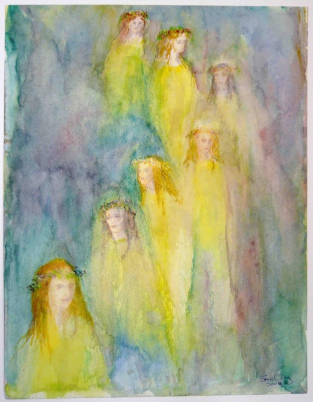 The Procession (watercolour), Sara Clay
The Procession was inspired by a snapshot of the “Goddess” procession down Glastonbury Tor. The original watercolour version (above) made me realise I wanted to work larger, and in oils again, which I hadn’t used since my teens. This watercolour was (as I recall) the first painting I sold in our artists’ cooperative gallery. I like this version almost better than the later oil on canvas version below, which was probably inspired more by Marion Zimmer Bradley’s iconic novel The Mists of Avalon, which I’d read the year before I emigrated to England & settled in Glastonbury. (This painting is my best-seller, locally, in terms of cards & prints, we're not selling the original):
 Procession, oil on canvas, by Sara Clay
The Gathering (below) was the first of my mystical figures-emerging-from-abstract-washes paintings (oil on canvas). The first people that I saw were the couple right-centre, the others emerged one by one. (Every time I look at it, I still see more faces & figures, but I had to stop & hang it on the wall!)
 The Gathering, oil on canvas, by Sara Clay
By the way, phenomenon (or trick of the brain) whereby artists start seeing things in random texture is called pareidoilia. Leonardo da Vinci recommended the technique, writing:
If you look at any walls spotted with various stains or with a mixture of different kinds of stones, if you are about to invent some scene you will be able to see in it a resemblance to various different landscapes adorned with mountains, rivers, rocks, trees, plains, wide valleys, and various groups of hills. You will also be able to see divers combats and figures in quick movement, and strange expressions of faces, and outlandish costumes, and an infinite number of things which you can then reduce into separate and well conceived forms.
I’ve got that quote framed in our gallery!
Painting and Commentary by Ralphdog
 Forest Winter Sunrise; 12x16” oil on linen panel, by Geoffrey Wittig
The above painting is the result of my usual working methods. This February I got up before dawn after the last significant snow of the season and went hiking on our partly wooded hilltop. I took a bunch of photographs with an eye toward painting. Some hardy souls can paint outdoors in winter, but I’m not one of them; I’m shivering uncontrollably after 15 minutes. Two weeks ago I sat down with a laptop and reviewed the photos. I did some small pen & marker thumbnail sketches to find a composition that worked. I start the painting by toning a linen panel with a warm mid-toned mix of transparent oxide red and VanDyke brown, and rag out the lighter areas with solvent on a paper towel. I fiddle with the placement of the lights and darks until the drawing is accurate. I then loosely blocked in the big shapes with thin paint using large soft brushes, taking care to get the value (light to dark) and color temperature (warm/orange to cool/blue) reading correctly. I then work back to front, starting with the sky and rising sun, then the background trees taking care not to get too fiddly or tight. The sunlit and shadowed snow came next, and the foreground trees last.
The real trick with winter paintings is getting the snow to ‘read’ correctly. It’s never stark white, but reflects the color of the sunlight, the blue sky above, or the trees standing in it. Getting some color into the snow is essential to getting a painting to ‘feel’ right, but you don’t want to go over the line to garish. It’s also a challenge to pitch the value of the snow on the near side of the trees dark enough to feel shadowed but light enough to read as snow.
I attempted my first oil painting in 2012. It was God-awful. I have no innate talent or native drawing skills. But there are endless resources for learning in the form of printed books, on-line teaching, in-person workshops and DVDs. My experience suggests that anyone can become a competent landscape painter within about 5 years if they’re willing to devote sufficient time and effort to it. The process is endlessly fascinating, and you see the world differently. You start seeing beauty everywhere.
Art and Commentary by Gwennedd
I’ve been experimenting lately with pour painting, using it for backgrounds for my experiments and doodles. The pours are pre- painted then a variety of colours are poured and splashed carefully over top of the prepared wood or canvas. I strictly control where the paints go so as to get the effect I want. The underpaint will “cell” or show through like mini explosions. Many of the backgrounds look remarkably similar to space...which is the effect I was looking for. I then let the piece dry and map out what I want to put on the piece. I will use a gold art pen to paint the “space stations” or drawings on using the tools you see in the last image. Not all the pours become backgrounds for doodles, some, like the first image are a mix of paints, texture paste, marking tools and specialty paints that are metallics or will colour shift. Others didn’t turn out as I hoped and became backgrounds for other paintings. Not everything is worthy of being called “art”.
Lechyd da...Gwennedd.


