Let me be clear: this isn't a strategy diary. I don't have time for that, and I think we're in the usual hand-wringing mode anyway. This diary compares Massachusetts town-level results for Obama in 2008 and Coakley last night to ask, more or less: where did Coakley lose? Did "the base" do her in?
Well, she lost everywhere -- but, in percentage terms, she ran almost as strong as Obama in the places where he did best. And turnout didn't kill her, either. It looks to me like the swing voters (or at least the swing towns and cities) swung against her. Follow me for a few pictures and numbers.
Last night's vote counts are from the Boston Globe; 2008 results are from Dave Leip.
First up: Coakley's vote shares compared with Obama's.
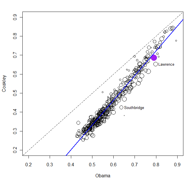
A quick tour: each circle represents a town or city; the larger the circle, the more votes cast in the place. The horizontal axis gives Obama's vote share in 2008; the vertical axis gives Coakley's. The dashed line represents equal vote shares; the solid blue line is an Ordinary Least Squares best-fit line, which fits pretty well. (Weighting by size doesn't make much difference.) The purple circle is Boston; I've named two other places where Coakley underperformed.
Notice how the best-fit line is fairly close to the dashed line on the right side, but not at all close on the left side. Basically, this indicates that Coakley's vote shares were relatively close to Obama's in the places that were real Democratic strongholds, but where Obama did not run as well, she was further behind him. There is more to the story, but that is where it starts.
What about turnout? Was the turnout in Democratic strongholds brutally bad? Not really. If we use 2008 turnout and Obama vote share to "predict" last night's turnout, Obama vote share does have a negative coefficient. That result means that turnout tended to be disproportionately low, compared with 2008, in the places where Obama did best. The turnout gap between places where Obama got 80% of the vote and where he got only 50% of the vote -- controlling for turnout in 2008 -- is 4 or 5 points. Here is one way of looking at that relationship, called a conditioning plot.
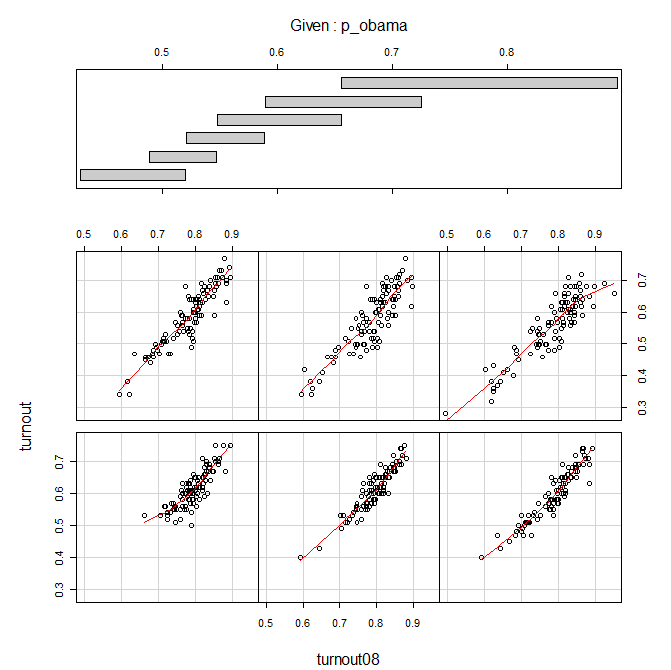
Each panel of the plot shows the relationship between 2008 turnout (horizontal) and last night's turnout (vertical) for one subset of Obama vote shares ("p_obama"). The bars at the top indicate the p_obama ranges. For instance, the panel at lower left is for Obama vote shares below about 53%; the bottom center panel is for vote shares between about 49% and 55%; at the other extreme, the panel at upper right is for vote shares over about 65%. The red lines are Lowess "smoothers" (rather like the ones on pollster.com charts). If you look closely, the red lines drift downward somewhat as Obama vote share increases, but not very much.
Another way of looking at this question is to ask: how would Coakley have done if turnout last night had been the same as in 2008? That is, in each place, I reckoned Coakley and Brown's vote shares, multiplied by total votes cast in 2008, and added up the totals. The result: the simulated losing margin given 2008 turnout is almost identical to last night's losing margin, very slightly under 110,000 votes. Of course, more votes were cast in 2008, so the percentage margin in the simulation is smaller, about 3.5% instead of 4.9%. But that's a pretty small difference, compared with the nasty slant of the best-fit line in the first plot.
So, for what it's worth, it doesn't appear to me that low turnout (and/or defections) among the "base" killed Coakley; it looks more like swing voters swung against her. Note, however, that we can't tell anything about individual voters or non-voters here; we're just looking for clues based on town/city-level results. If, for instance, you want to argue that the people I'm characterizing as "swing voters" here damn well ought to be part of the base, maybe you're right. This is by no means a complete analysis, just food for thought.
