 As campaign-weary Iowans file into high school gyms and church fellowship halls for tonight's caucuses, they'll be surrounded on all sides by signs, stickers, T-shirts, and buttons featuring the campaign logos of the candidates vying for their support. I've been a fan of campaign logos—the usually homely, often garish, sometimes sublime marks candidates use to advertise themselves—as long as I can remember. Just as I did four years ago, I wanted to take a look at the ones used by the primary candidates in 2012: the good, the bad, and, God help us, the ugly.
Last time, the logos ran the gamut from the fantastic (John Edwards, Rudy Giuliani) to the hideous (Duncan Hunter, Jim Gilmore—yep, they actually ran for President), and featured an entry from a certain Illinois senator that is certain to go down in history as one of the most famous campaign logos of all time. We don't see the range in quality that we saw in 2008; most are clustered around the midrange, and are destined to be forgotten as soon as their candidates are out of the race—which could be as early as tonight for some of them. So let's get to it before it's too late.

Jon Huntsman may come in last tonight, but his campaign logo easily beats everyone else's; enjoy this one while you can. The "H" lettermark, employing a nice stencil-like motif that doesn't appear elsewhere in the logo, recalls the classic "O" of the Obama campaign but with an understated, minimalist twist. The rest of the logo is set in Gill Sans, a classic face that gets heavy use these days but never seems worn out. Perhaps most importantly, Huntsman is somehow the only challenger who obeys the First Law of Presidential Campaign Logos (serif for incumbents, sans-serif for challengers). The gods of politics will not be mocked, and can be expected to take their wrath out on whichever non-Huntsman candidate eventually wins the nomination. Grade: A-

Rick Santorum may be one of the worst human beings in America, but he finishes unexpectedly high on my list with a classy logo that's conservative without being old-fashioned. The red and blue colors, which are de rigueur for candidates for any office above the local level, are muted here, in contrast to the oversaturated circus sideshow palettes usually seen in political races. The typeface (Baskerville) is nice but unobtrusive. What really makes this logo work, though, is the eagle graphic. Real-world artifacts like eagles and flags can be tough to get right: go too realistic and it just looks like bad clip art, go too abstract and no one can tell what it is. Santorum gets it just right—it looks good, you can tell it's an eagle, but it's not too literal. The letters F-R-E-E-D-O-M replacing the stars above the eagle's head are a nice touch that isn't readily apparent on first glance but rewards close observation. Grade: B
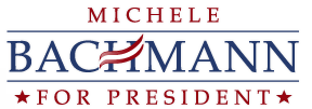
Now the slide into mediocrity begins. Michele Bachmann sports a desultory logo that seems to have been designed in response to a checklist: it's red and blue, it has stars on it, there's a striped thingy that sort of suggests a flag, it uses a typeface (Palatino) that's pleasing to the eye but well-known enough that no one's going to think it's avant-garde or homosexual or anything like that. I'm giving this a higher grade than it probably deserves, mainly because I really like Palatino. Grade: C

Ron Paul basically uses the same logo as Michele Bachmann, except with a slightly different font (
Minion, a boring face that comes with Adobe Creative Suite programs) and a highly literal, Great Seal-inspired eagle in the background—do you see now why I said that's a bad idea? Since it's the same logo as Bachmann's, I'm giving it the same grade.
Grade: C

Newt Gingrich, for some reason, seems to have been inspired by nothing so much as the logo of the New England Patriots (much like Tim Pawlenty, though at least his logo doesn't go as horrifyingly wrong as Pawlenty's did). The goofy Web 2.0 gradient on the star is a minus, although I guess it at least demonstrates that Gingrich is aware of the 21st century—unlike, say, Ron Paul. At the end of the day, though, I have to take off half a grade for Gingrich's use of Times New Roman, which practically screams I don't care. I envision the candidate himself "designing" this logo by opening Microsoft Word, typing "NEWT 2012" in 72-point type, and brusquely ordering a lackey to "spruce it up somehow" before taking it to the printers because he has more important things to do. Grade: C-

I wonder if anyone at the Romney campaign has noticed that they've basically stolen the Girl Scouts logo and passed it off as their own. (I would also have accepted "PBS" as an answer.) The rest of the logo is set in Trajan, which is rapidly becoming a favorite font for lazy candidates looking to borrow a bit of gravitas without actually working too hard. It's not a terrible logo, certainly not in comparison to others I've seen, but still... it's the Girl Scouts logo, Mitt! It's the Girl Scouts logo! Grade: C-
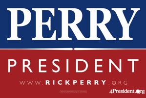
Rick Perry's logo is big and offensive, about like you'd expect. The giant PERRY (set in some variety of Garamond, I believe) recalls 2008's RUDY, which I liked at the time, but whereas Giuliani's logo looked bold and assertive, this one just makes Perry look like kind of a dick, somehow. Maybe that's because Giuliani's logo only used his first name, a gutsy tactic that's really only available to people with unusual names, like Hillary Clinton in 2008 and Newt Gingrich this year. If you're going to do that, you might as well go all in and use up as much space on the sign as you can. Doing the same thing with your last name just makes it look like you're a bit too in love with yourself. Grade: D+

