As a stats and graphics geek, I love, love, love seeing the great Calculated Risk chart showing how this recession compares to previous ones, not because it's always happy news (obviously) but because it's such a smart, succinct, and striking presentation of data.
Essentially, this chart asks "by what percentage as of each month had we dropped below our peak job growth from the month before the recession began?" With respect to the current recession, that means "how far are we below the 138,023,000 jobs that were reportedly held in January 2008?" Getting back to that figure won't be enough, of course -- population has grown since then, for one thing -- but that marks the end of the job recession, of which this is already the deepest and longest on record post WWII.
I got to thinking today: how long would we expect the jobs recession to last? So I took a deeper look at the Calculated Risk chart (shown below the worm orgy) than I ever have before.
What I did was to extend the right side of the chart until the point where it looked like, presuming linear improvement, we would cross from the red into the black on jobs. I then drew an extrapolated line, based on recent job growth, to see how many months it would take to cross. I figured from the past 53 months of the chart how much space on the horizontal axis was taken up by each month, and then calculated how many months of recession it looked like we'd have left.
I suspect that we may have some objections over my methodology. Before anyone says anything rash, I know that we can't presume linear improvement, but it's not a bad place to start our modeling, for reasons I'll explain. And I know that this recession may be different from other ones because of various factors including the depth of the wound and the fact that Republicans are trying so very hard to keep us from fixing it -- but in this respect I don't think it is. And I know that some exogenous event -- another oil shock, another huge financial collapse -- could throw us off course. I accept those reservations. But, putting those aside as we try to generate a best estimate, what would that best estimate be?
January 2016. That's right -- a re-elected Obama could expect our country to have fully returned from the jobs recession at about the time of the next New Hampshire primary. That means that Obama would, uniquely so far as I can tell, have spent his entire presidency until the beginning of his lame duck year dealing with an economy straining even to regain its position from before the recession. That's pretty astounding.
Now let's have a look at that in graphic terms.
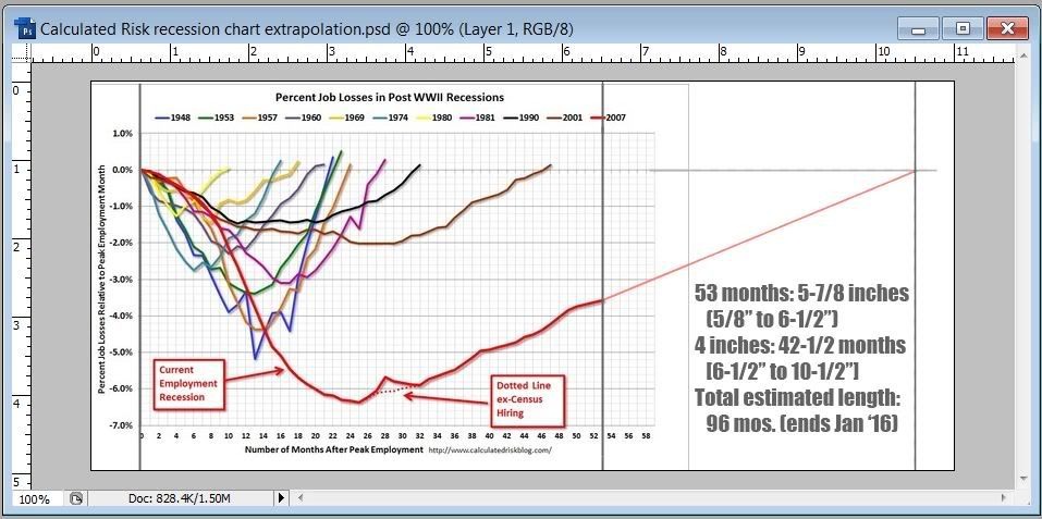
I've taken a screen capture including my ruler so that you can see how I did the calculations. The 53 months from January 2008 until June 2012 take up 47/8 (or 5-7/8 if you prefer) of the chart; we finally pass 138,000 jobs again after another 4 inches of my chart, corresponding to another 42-1/2 months, such that the recessions end between 95 and 96 months later.
Now hold on -- do I expect you to believe that drawing a straight line like this has any sort of predictive power? I do expect you to believe it -- but not on faith. Let's look at data.
What struck me in looking at the chart today is that the past two jobs recessions -- 1990 (in black) and 2001 (in brown) -- have a different shape than the ones preceding them; that shape in turn more or less matches the one of the present jobs recession. It's a slower descent, and a much slower recovery, than we've seen before. Maybe there's something different about recessions now -- an observation that I'm confident does not originate with me.
What's interesting, though, is that if you draw a line from the month that the final upswing seemed to be fairly embedded -- in our case, April 2010 (month 27) or so -- through the point where we cross into the black, it's a pretty straight line. (I use the line that excludes census hires, which seems appropriate.) Look at the brown line starting in month 30; look at the black line beginning in month 20. Follow them through to the end and, except for an unexpected boost in the last few months of the latter, they're pretty consistent. So I think that it's fine to draw a line to get an estimate. Even in the two deepest postwar recessions before this -- 1948 (the blue line) and 1957 (the orange line), you can draw a line from respectively month 13 and month 15 to the point of intersection the 0% line and it's pretty accurate, even though there was clearly an unexpected drop for a while in 1949. The interesting thing to me is that it got on track to where it would have been before that downward jag.
I'm not sure whether to find this prospect of 3-1/2 more years of recession more disturbing (it goes on and on -- but what did we respect?) or comforting (it eventually ends -- but what did we exoect?), but I do find it interesting. So put me down for a recovery in January 2016 if Obama is re-elected. (I expect more like January 3016 if Romney is elected, but I won't be around to collect or to pay.)
