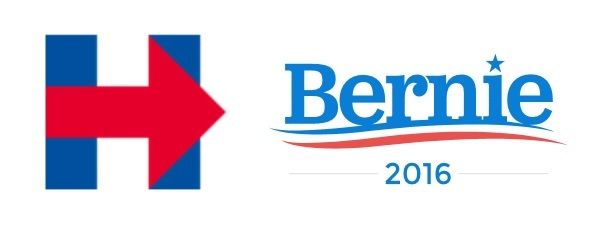
Jarring at first, Hillary's extremely nontraditional logo has been mocked but also hailed (for example in this article) as quite clever and very flexible.
Bernie's is the opposite of jarring and nontraditional. Easygoing patriotic wave that works just as well on a can of cola or a tube of toothpaste. Very friendly font. For decades he's used just his first name on his campaign posters, but typically red has been the dominant color. I think blue works well, and this shade (is it azure?) is easy on the eyes.
In the article linked above, there's a reference to Sol Sender, the designer of Obama's logo, who says that Obama's and Hillary's logos work toward countering certain perceived weaknesses (Obama's name rings foreign - thus his logo emphasizes the American flag; Hillary gets associated with the past, so her logo emphasizes moving forward). From that perspective, I'd say Bernie's super-friendly, patriotic logo works toward countering the caricature of him as too extreme or too "angry."
